You can now easily add historical averages to your charts to help understand trends in performance, merge one dashboard into another, and report on fiscal quarters just like you'd report on normal quarters of the year.
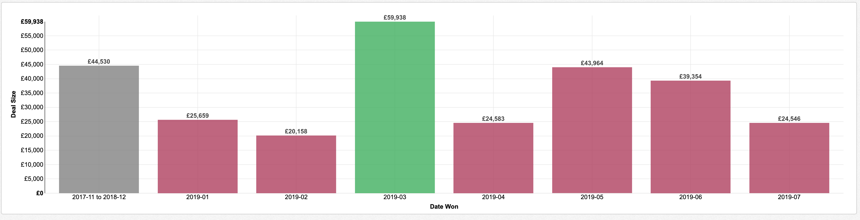
Chart trend comparisons calculate the historical average of the chart measure and add that average to the left side of the chart. For column and bar charts, the rest of the bars will automatically be colored to reflect positive or negative performance relative to that trend:
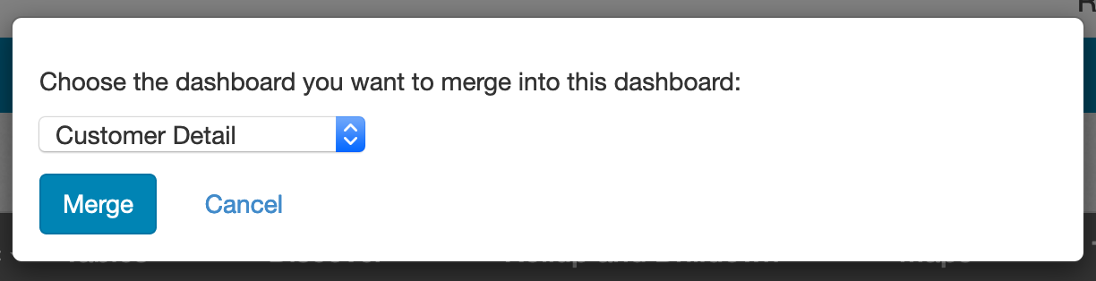
You can now add merge two dashboards together. You can perform this action through the dashboard editor. Click on Quick Actions, then Merge Another Dashboard. Choose the dashboard you want to merge in and click Merge:
The selected dashboard will be added as new page(s) to the dashboard you have open in the editor.
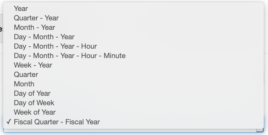
If you have a custom fiscal calendar start month defined under Account Settings, you can now report on your fiscal quarters just like you'd report on normal quarter of year. From editing a date field, the date level dropdown now includes an option for Fiscal Quarter - Fiscal Year at the bottom of the list of options:
You can combine this setting with rolling filter options such as This Fiscal Year, This Fiscal Quarter, and more to report on your data in terms of a fiscal calendar: